Climate & Site Analysis
Climate Analysis
Climate is the most important environmental factor and the first one that architects and engineers should consider when designing a building. To achieve a net-zero energy building, the design must consider the building’s specific site climate.
The climate can dictate what passive design strategies are most suitable and effective for the building site. For example, strategies that are perfect for a hot dry location may be counterproductive in a cold humid climate.

Different climate zones around the world
A site’s climate is dictated by its latitude, altitude, and terrain. A site located at 60°N on a mountain top will require very different design strategies from a site at 7°S at sea level. Climate influences many aspects of building design such as what the indoor temperature should be, what are the factors defining human thermal comfort, and predicting energy loads for the building.
A common misconception is that climate and weather are interchangeable terms to describe the same thing. This is not true. Climate refers to the average atmospheric conditions over a long period of time, whereas weather refers to the daily temperatures and atmospheric conditions. For example, climate change refers to the changing daily weather patterns over a long period of time.
Climate Classification
Designers can choose passive design strategies suited for their building based on the climate type. Specific classifications of climates vary; however, they can all be useful in determining appropriate design strategies. For instance, the Köppen-Geiger climate classification system is internationally used; however, the US Department of Energy has a guide to US climate zones, and the state of California has its own specific guide to California climate zones.
Climate classification systems are useful in determining overall passive design strategies to implement; however, they often do not consider microclimates. Microclimates are small areas that feature different climate characteristics from the overall climate zone they are located within. They are caused by different topographies, bodies of water, vegetation, and site surroundings. For example, San Francisco is famous for its microclimates. It can be very sunny and feel warm in some neighborhoods, while it’s foggy and cold less than a mile away. This is caused by that city’s famously hilly topography, among other factors. Also see Building Site Surroundings.
Temperature
Temperature varies throughout the day and throughout the year and is the most obvious metric to consider for passive heating and cooling design.
Two basic aspects of temperature are dry bulb temperature and wet bulb temperature. From these metrics, you can learn about both the air temperature and the humidity.

Temperature data given as a monthly average and as a daily average
Dry Bulb Temperature
Dry bulb temperature is simply the temperature of the air. It does not consider moisture. It is measured in degrees Celsius, degrees Fahrenheit, or Kelvin and can be measured with a thermometer exposed to the air. It is commonly referred to as the air temperature and is reported in basic weather reports.
Wet Bulb Temperature
Wet bulb temperature is the air temperature that takes into account the cooling potential of evaporation. It is measured by exposing a moistened thermometer bulb to air flow (wrapping a thermometer bulb in wet cloth and swinging it in the air). The evaporation of the moisture depends on the humidity of the air (think about how slowly it takes wet hair to dry on a humid day). Similar to the dry bulb temperature, wet bulb temperature can be measured in degrees Celsius, degrees Fahrenheit, or Kelvin.
Together, dry bulb and wet bulb temperatures can describe humidity.
Degree Days

Degree days are temperature past a threshold, multiplied by time
To get a sense for the heating and cooling requirements for your building site, a comfortable temperature range needs to be set. This range, often referred to as the “comfort zone,” can then be compared to the building site’s actual temperatures over time. When the site’s temperature is outside of the comfort zone, it is measured in heating or cooling “degree days.”
For example…
- If the weather is an average of one degree warmer than comfortable for one day, we say the building needs one “degree day” worth of cooling to stay comfortable.
- If the weather is an average of ten degrees warmer for one day, or is one degree warmer for ten days, then the building needs ten cooling degree days.
- If the weather is ten degrees below the comfortable minimum for a day, then the building needs ten heating degree days.
Degree days are not just useful to estimate heating and cooling needs; they also help make comparisons between buildings more fair. A building in a mild climate like San Francisco will need less heating and cooling energy than a building in a cold climate like Moscow, even if the Moscow building is much better built. Comparing the energy intensities of different buildings with the heating and cooling degree days at each site helps make these comparisons more accurate representations of how efficiently the buildings are designed.

This graph from Montreal shows that in January there are almost 800 heating degree days to stay comfortable
Reading Temperature Charts
Temperature data can be represented in a variety ways. Fully utilizing temperature charts will help inform your design decisions and make sure you are considering all the data.

Tabular temperature data can be clearly represented in a variety of different charts.
Monthly Design Temperatures
Of course, temperatures are not always consistent at the same time of day or year. Designs that always achieve occupant comfort must consider extreme circumstances as well as average conditions.

Monthly temperature design data graph
The graph above shows not only monthly temperatures averaged from historical climate data, but also two levels of uncommon extremes.
The green boxes show the historical averages of monthly highest and lowest dry bulb temperatures; your site is virtually guaranteed to experience these temperatures in these months, so they must be designed for.
The extensions of the boxes show extreme temperatures only recorded 1% of the time in historical data. Your site is not likely to experience these often, but for a robust design, you should consider them.

You can see that this site has significantly less variation than the previous graph. In April, a peak temperature of 64° F has occurred, but generally the temperature range will be between 48° and 57° F for the month.
Diurnal Weather Averages
Diurnal temperature data shows daily cycles of temperature and radiation on the site. The data typically includes dry bulb temperature, wet bulb temperature, direct solar radiation, and diffuse solar radiation as a daily average for each month. From this data you can study the difference between dry bulb and wet bulb temperatures (relative humidity indicator), the difference between nighttime temperatures and daytime temperatures (known as the diurnal swing), and solar radiation patterns in addition to much more.

Annual Temperature Bins
For some sites, heating will dominate your design requirements most of the year; for other sites cooling will dominate. You can quickly see what temperatures are experienced at your site most often by looking at a histogram of temperature throughout the year. This is referred to as temperature bins.

Annual temperature bins for a colder site, mostly requiring heating for comfort. The graph also displays the frequency of wet bulb and dry bulb temperatures, suggesting the climate does not have humid summers.
Humidity
Humidity can be just as important as temperature for human comfort. Too much humidity can amplify the heat and make it feel “muggy”, while not enough humidity can be uncomfortably dry.
Warm air can hold more moisture than cold air can, but people don’t perceive the absolute number of water molecules in the air (absolute humidity which is measured as density), they perceive relative humidity which is represented as a percentage of water vapor in the air.

This graph of temperature bins compares wet bulb and dry bulb temperatures and helps understand humidity. The larger the difference between the dry and wet bulb temperatures, the drier the air and the lower the relative humidity is. You can see that Copenhagen is relatively humid because the temperature bins are roughly the same size and distribution for wet and dry bulb temperature.
People generally consider 40% to 55% relative humidity to be comfortable. Below 40% will feel dry, above 55% will feel muggy and wet (unless the temperature is cold).
Humidity also affects what passive heating or cooling strategies will be most effective. For instance, evaporative cooling is much more effective in dry climates.
Controlling humidity is also an important function of active HVAC systems. There is a lot of latent heat in water, and de-humidifying the air requires cooling that water – which can require a lot of cooling energy. See more on heat energy flows in buildings.
Humidity can be determined by comparing wet bulb and dry bulb temperatures. At 100% humidity the air is completely saturated and the dry bulb and wet bulb temperatures will be the same. In all other scenarios, the wet bulb temperature will always be less than the dry bulb temperature due to evaporative cooling. The larger the difference between the dry and wet bulb temperatures, the drier the air and the lower the relative humidity is.
Humidity data is often displayed in a psychrometric chart. To learn how to read these charts, see the Psychrometrics page.
Like temperature, humidity varies throughout the day and year, and robust design requires designing for a range of humidities. You can graph humidity variation to help set your design requirements.

Humidity variation through a year at a site
The graph above shows average humidity in morning and evening from the historical record, with a thick colored band illustrating average daily range in humidity. The much wider translucent band bounded by dotted lines shows the full range of maximum and minimum humidity in the historical record. As with temperature variation, these extremes are not experienced often, but should be considered in the design.
Besides affecting cooling energy demands, humidity can also affect other sustainable design factors, such as the design of the building envelope.
Solar Position
The earth movement around the sun generates sun paths that varied through the day and the year, and it is one of most crucial environmental factors to understand when designing high performance buildings.
If you design your building with careful consideration of the sun’s path, you can take advantage of strategies such as natural daylighting, passive heating, PV energy generation and even natural ventilation. However, if you are not careful, these same opportunities can work against you, producing glare or overheating.

Sun Path and Solar Position
The first thing to understand is the sun’s path at your location. At any given point on the sun’s path, its height in the sky is called its altitude and its horizontal angle relative to true north is called its azimuth.
Seasonal Variations and Important Dates
The sun’s path varies throughout the year. In the summer the sun is high in the sky, and rises and sets north of east-west in the northern hemisphere (in the southern hemisphere, it’s south of east-west). It also rises much earlier and sets much later in summer than in winter. To study the extreme of hot summer sun, you often want to study the sun’s path on the summer solstice, the day when the sun is at its highest noon altitude.
In the winter the sun is low in the sky, and rises and sets south of east-west in the northern hemisphere (in the southern hemisphere, it’s north of east-west). To study the extreme of the winter sun path, you often want to study the sun’s path on the winter solstice, the day when the sun is at its lowest noon altitude.
To study more average positions, you can look at the sun’s path on the spring and autumn equinoxes, when the sun rises and sets due east-west. The altitude of the noon sun at the equinox is determined by the latitude of the site. This is why the rule-of-thumb for the optimum angle of solar panels is the latitude of the site. At this angle, the sun’s rays are most perpendicular to the panel for most of the year.

There are four important dates to remember when considering sun position
Some tips and rules of thumb include:
- Study particular days:
- The solstices: Study the extremes of the sun’s position.
- The equinoxes: Study average sun position.
- Study different seasons:
- Winter studies: How can you maximize sun to passively heat the building?
- Summer studies: How can you minimize sun to passively cool the building?
Look at specific times of day:
Morning: You may want to capture sun’s energy to warm up spaces when the sun is low in sky. But you’ll also need to protect against glare.
Noon: Sun is the strongest and highest in the sky. You may want to avoid the hot midday sun to reduce cooling loads in some areas. But you may want to capture the sun in other cases for passive solar heating or energy generation.
Note that sometimes noon is not the highest altitude angle. This is because of the difference between “solar time” (determined by position of sun) and “local time” (determined by time zone).
Afternoon: You may want to prevent overheating and glare
Occupancy hours: You may be particularly concerned about the times when the building is most heavily occupied.
Solar Time vs. Local Time
In most locations, there will normally be a difference between solar and local time. Solar time is determined by the position of the sun. At noon it is at its highest altitude, with sunrise and sunset occurring at symmetrical times either side of noon.
Local (or clock) time is determined by the local time zone and is taken at a reference longitude. For example, the local time zone for Perth is taken at a longitude of 120° (in the middle of Western Australia). However, the longitude of Perth is 116°.
For each degree of difference in longitude between the actual and reference, there is a 4-minute time difference. Thus, to convert solar time to local time, use the following formula:
Tlocal = Tsolar + ((Longitude – Longituderef) * 4)
If you notice in some of your analyses that the sun is not the highest at noon on your building site, this is the reason.
You’ll usually want to do analysis with respect to local times because that’s the time that all other members of the design team will be referencing for things like operation schedules.
Visualizing the Sun Path
There are several ways of visualizing the sun’s path.
Stereographic sun path diagrams are used to read the solar azimuth and altitude throughout the day and year for a given position on the earth. They can be likened to a photograph of the sky, taken looking straight up towards the zenith, with a 180° fish-eye lens. The paths of the sun at different times of the year can then be projected onto this flattened hemisphere for any location on Earth.

Summer Sunpath: On the left is a 3D visualization of the stereographic diagram on the right, showing the movement of the sun throughout the day on June 21st. (summer solstice)

Winter Sunpath: On the left is a 3D visualization of the stereographic diagram on the right, showing the movement of the sun throughout the day on December 21st (winter solstice)

The Sun at Noon: On the left is a 3D visualization of the stereographic diagram on the right, showing the position of the sun throughout the year at the fixed hour of 12pm.
Reading Sun Path Diagrams
Sun path diagrams can tell you a lot about how the sun will impact your site and building throughout the year. Stereographic sun path diagrams can be used to read the solar azimuth and altitude for a given location.
Stereographic Sun Path Diagrams

Note that these stereographic diagrams are not exactly like a fish-eye photo: such an image would be flipped left-to-right. These diagrams are from the point of view of the sky looking down at the ground, you can superimpose it on a map or a plan of the building without being confused. (You can see this by following the hour lines from east to west on the diagram.)
- Azimuth Lines – Azimuth angles run around the edge of the diagram.
- Altitude Lines – Altitude angles are represented as concentric circular dotted lines that run from the center of the diagram out.
- Date Lines – Date lines start on the eastern side of the graph and run to the western side and represent the path of the sun on one particular day of the year.
- Hour Lines/ Analemma – Hour lines are shown as figure-eight-type lines that intersect the date lines and represent the position of the sun at a specific hour of the day. The intersection points between date and hour lines give the position of the sun.
Reading the Sun Position (Step-by-Step)

Annotated stereographic sun path diagram
- Locate the required hour line on the diagram.
- Locate the required date line, remembering that solid are used for Jan-June and dotted lines for July-Dec.
- Find the intersection point of the hour and date lines. Remember to intersect solid with solid and dotted with dotted lines.
- Draw a line from the very center of the diagram, through the intersection point, out to the perimeter of the diagram.
- Read the azimuth as an angle taken clockwise from north. In this case, the value is about 62°.
- Trace a concentric circle around from the intersection point to the vertical north axis, on which is displayed the altitude angles.
- Interpolate between the concentric circle lines to find the altitude. In this case the intersection point sits exactly on the 30° line.
- This gives the position of the sun, fully defined as an azimuth and altitude

Sun charts illustrating the variation in the sun’s movement in relation to latitude.
The articles on passive heating, cooling, and daylighting will describe how to design for bringing the sun’s heat and light into the building at some times and keeping it out at other times.
Solar Radiation Metrics
Solar radiation is an important consideration in any building that strives for energy efficiency. Solar radiation equates to heat if it is allowed into a building or electricity if it is captured by a PV array.
Understanding the significance of solar radiation will help you to mass, orient and program your building to capitalize on the solar radiation characteristics of your site and climate. Knowing the metrics for solar radiation can help with your analysis.
The intensity of the sun varies by the clarity of the atmosphere and the angle at which the sun strikes a surface, called the “incident angle.” The more perpendicular the sun’s rays are to a surface, the more heat and light energy.
Incident Solar Radiation
Incident solar radiation is the amount of solar radiation energy received on a given surface during a given time. Values are given in units of energy per area (W/m2or BTU/hr/ft2) and are usually the single most valuable metric for early design studies. This is also sometimes called insolation (Incident Solar radiation) and is sometimes quoted in terms of energy accumulated per day or per year (kWh/m2/day or kWh/m2/yr).

Incident solar radiation, visualized in Autodesk Revit
Incident solar radiation values are based on two primary components:
- Direct radiation from the sun (direct beam radiation = Ib) which is always measured perpendicular to the sun’s rays
- Diffuse radiation that is both scattered by the clouds and atmosphere (diffuse sky radiation = Id) and the ground in front of the surface (Ir). This is always measured on a horizontal surface.
Sky conditions affect the intensity and distribution of solar radiation. A cloudy sky reduces the amount of direct beam radiation and increases the amount of diffuse sky radiation. For example a clear sky will allow for direct light to travel from the sun directly to your site/building, whereas a cloudy sky will filter the sunlight and scatter diffuse light around your location.
From the total energy of the sun, up to one third can be lost (reflected into space), about 20% reaches the surface as diffuse radiation, and the rest reaches the surface as direct radiation (source).
In addition to sunlight directly heating buildings, solar radiation also creates hotter weather and affects humidity. This is one reason it’s included in diurnal weather charts.

Diurnal weather average charts show both direct and diffuse solar radiation. When direct solar radiation varies a lot over the course of a year, it’s cloudy. You can see that Copenhagen is cloudy in the winter because the absolute value of direct radiation is much lower, and the proportion of diffuse to direct radiation is higher.
Absorbed, Transmitted, and Reflected Radiation
While incident solar radiation is just the amount of energy striking a given surface. It does not necessarily tell you how much radiation is being absorbed into the façade of the building, transmitted through a building’s windows, or reflected back. That depends on the material properties and is governed by the following equation:
100% incident – reflected = Absorbed + Transmitted
Analyzing Solar Radiation
Data for direct and diffuse solar radiation are included in the weather files that analysis software uses.
The incident solar radiation values actually calculated and visualized within Revit are based on your specific building geometry. They take the hourly direct and diffuse radiation data from your weather data, your building geometry, and the time period of the analysis into account. The results of the analysis are always over a given time period (often a single hour) and are presented in Wh/m2(or BTU/ft2). You can multiply by 317.15 to convert from kWh/m2to BTU/ft2.
The calculation used by the software includes shading from surrounding objects (Fshading), the portion of the sky “visible” by the surface (Fsky), and the angle of incidence between the sun and the face being analyzed (theta). Since incident solar radiation is just a measure of the amount of sun hitting a surface, it does not depend on material properties.

The basic equation behind the values given in the software is below:
Incident solar radiation = (Ib* Fshading* cos(theta)) + (Id* Fsky)+ Ir
Where:
Ib= direct beam radiation, measured perpendicular to the sun
Id= diffuse sky radiation, measured on horizontal plane
Ir= radiation reflected from the ground
Fshading= shading factor (1 if a point is not shaded, 0 if a point is shaded, a percentage if measured on a surface
Fsky= Visible sky factor (a percentage based on the shading mask)
Theta = angle of incidence between the sun and the face being analyzed
Time Periods for Solar Radiation Studies
You can choose different units for the simulation settings of solar radiation analysis. These different units have strengths and weaknesses based on the analysis you’re doing.
Peak
-
WHAT: The maximum value calculated during the study period.
-
WHEN: Often want to do this over a given day, month, or season to hone-in on the strongest sun.
- WHY: This metric is primarily used for sizing systems and HVAC equipment, and trying to avoid extremes. Solar load is one of the primary components of cooling loads.
- Cooling and Peak Solar Loads: What is the most solar gain you’ll experience on the hottest day in the summer? Can your building handle these peak solar loads? Can you reduce these gains with shading devices? As you reduce the peak cooling load, can you then reduce the HVAC system size?
- PV Panels: Finding the maximum amount of energy that you can expect to fall on the face of PV panel can help size PV inverters. However, a rule of thumb is that the peak is about 1000 W/m2 for most of the world – so this is often not done in practice.
Average
- WHAT: The hourly average of values over the defined study period. This average is based only on times when the sun is shining. Night time values are not included, even if you specify night time hours.
- WHEN: Determine average overall design conditions for a given month or season. Often calculated only during the building’s operating hours.
- WHY: This metric is primarily used for estimating energy use and gains over a defined time period. (Average radiation energy * total hours = total energy).
- Heating and Average Solar Loads: Estimate passive solar heating potential by studying the average solar radiation during times of low temperatures (when heating is needed).
- PV Panels and Passive Solar Heating: Find the total power available by multiplying the average solar radiation by total hours. Then multiply this value by an assumed system efficiency to get the total expected power output (for electricity generation, or heating).
Cumulative
- WHAT: The total of all values calculated over a given time period.
- WHEN: For whatever time period you’re interested in, you can determine total energy generation or savings. This method can be more accurate than using averages when studying specific time periods.
- WHY: Use when looking for the total energy that will be available over a given time period.
- Passive Heating and Cooling: Learn the heating/cooling load impact over a given time period and how much total energy will I have to manage. For example, what’s the total energy you can harvest for direct-gain system like a thermal mass wall?
- PV Potential: This is the primary application for cumulative metrics. What is the total energy that will fall on the face of a PV panel that will fall on a panel over a full year and over specific time periods. Can you match building loads with this production potential?
Reference material can be provided for different locations based on cumulative radiation over the course of a day. The chart below can help give a sense of scale for the amount of cumulative solar radiation to expect over the course of a day for different conditions. See table below for to give you a sense of scale for radiation on different faces of a building near and far from the equator.
A moment in time
Looking at the solar radiation at a specific time2is most valuable when you’re getting an initial understanding of the available energy on your site.
Using the sun path tool in conjunction with solar radiation results can be a very effective way to understand both the sun’s path and the resulting solar energy striking a face of the building. Note that when studying real-time radiation, the results are the same if you select Peak, Average, or cumulative.
As a reference point, the average incident solar radiation across the entire earth is about 240 W/m².
Sky Conditions & Precipitation
As the sun moves, it can encounter sky conditions that can intensify it or obscure it. It is important to understand these metrics and account for them when designing a net zero energy building.
Clouds
The frequency and opacity of cloudcover must be modeled in order to ensure good passive design.

Insolation for a given location through the year, with no clouds (theoretical)
and with typical cloud occurrences
Clouds not only block sunlight for a building, but also diffuse it. This is especially important for daylighting, as it changes the distribution of incoming light in a space.
Clouds are an important determinant of the “sky illuminance conditions” that are used to model sunlight and daylight. The Commission International de l’Eclairage (CIE) has standards for how to consider clear, uniform, and overcast skies. Usually overcast skies are used as design criteria because they represent worst-case scenarios. However, for buildings near the equator, uniform skies may be more accurate.
Cloudcover data will generally be contained in .WEA or .EPW files, along with other weather data. Usually data for incident solar radiation will automatically include the effects of cloudcover.

180° sky brightness for clear sky, intermediate sky, and overcast sky,
each shown both as true brightness and color-coded for easier distinction
Direct and Diffuse Solar Radiation
The sun’s intensity is often called “insolation” (this is short for “INcident SOLar radiATION”, and is not to be confused with insulation) and is important for passive design strategies and energy generation.
Incident solar radiation values are based on two primary components: direct radiation from the sun and diffuse radiation that is scattered by the clouds and atmosphere (and the ground in front of the surface). A cloudy sky reduces the amount of direct beam radiation and increases the amount of diffuse sky radiation.

Insolation for a given site and surface orientation
Solar radiation data are usually contained in weather files (.wea or .epw), see the solar radiation metrics page to learn more about these values.
Precipitation
Rain and snow affect many aspects of green buildings–thermal comfort, daylighting, solar power production, rainwater harvesting, and more.
Even the structure of the building can depend on precipitation. Many mountain climates get heavy snow loads that require roofs and walls to be sturdier than snowless locations.
Wind
Wind provides natural ventilation and usually cools buildings and people because it accelerates the rate of heat transfer. Wind speed and direction change throughout the day and year, and are not as universally predictable.

Knowing your location’s wind patterns influences important environmental and structural considerations.
As an asset, wind can help facilitate natural ventilation and passively increase occupant comfort – think of a nice breeze on a hot day. The wind can also be harnessed to generate electricity via windmills, although this is typically not as efficient as solar energy for small scale applications.
As a hindrance, wind can drive moisture and water up through small gaps in your building envelope, resulting in potentially devastating consequences if not properly controlled.
Predicting Wind Behavior
Air flows from high pressure to low pressure. This is important to remember because this is the basic principle behind wind ventilation and stack ventilation.
When wind encounters an obstruction, it will flow around the object and continue moving in the same direction. This is similar to the flow of water (both air and water are fluids – See the Metrics and Basics of Fluid Flow). It is important to note that if wind is blocked by a landform or surrounding building, the wind is not stopped, but rather just deflected.
Wind speed varies with height and terrain. As elevation increases, so does wind speed. As terrain becomes rougher, the rate at which wind speed increases slows. This means that the wind speed in an open, rural, environment will increase with height much more quickly than the wind speed in a dense urban center. This rate of increase is known as a wind gradient, or wind profile. As a result, wind velocity can vary between different terrains at the same elevation.
In dense urban environments, wind will reach 100% velocity at a much higher altitude than an open environment with no buildings. This can be seen in the image below.

Wind does not reach full speed until a certain height off the ground; this height depends on the local obstructions.
Wind and Microclimates
Environmental surroundings can create microclimates that could significantly alter the wind patterns on your site. Prevailing wind directions can change due to adjacent landforms, buildings, and/or other objects. If you’re in a different microclimate than the nearest weather station, you can’t reliably use that data to guide your design. Features to pay attention to are large bodies of water and changes in elevation. Modeling the surrounding area, and measuring conditions on the actual site, can provide better information on the exact wind conditions of that site.
While microclimates can lead to unpredictable winds, there are some general assumptions that can be made about the behavior of air flow. Near bodies of water, the land is hotter during the day, so as the air over the land gets warmer and rises, it is replaced by cooler air coming from over the water – so the wind blows from the water onto the land. At night, this effect is reversed. The water is warmer than the land, so the air over the water gets warmer and rises and is replaced by the cooler air coming from over the land – so the wind blows from the land to the water.
During the day in a valley, wind will blow uphill because the sun warms the air and causes it to rise. At night, wind will blow downhill because the air is cooled by the cold ground surface causing it to sink into the valley.
Wind Speed
Understanding wind speed is just as important as understanding where the wind is coming from. Wind can gently rustle leaves on a tree, or it can cause severe structural damage to buildings. It all depends on how fast it is moving.
Wind speed is commonly measured in knots, miles per hour, meters per second, or feet per second. There are a host of conversion tools available online (example: NOAA Wind Conversion Tool).
The table below translates wind velocity to visual movement on land. It has been adapted from the Beaufort Wind Scale, a common scale for comparing wind speed that is used in many countries.
| Wind Speed | Description | Land Conditions |
|
< 1 km/h
< 1 mph
< 1 knot
< 0.3 m/s
|
Calm
(Beaufort #0)
|
Smoke rises vertically |
|
1.1 – 5.5 km/h
1 – 3 mph
1 – 3 knot
0.3 – 1.5 m/s
|
Light air
(Beaufort #1)
|
Smoke drift indicates direction; leaves are still
|
|
5.6 – 11 km/h
4 – 7 mph
4 – 6 knot
1.6 – 3.4 m/s
|
Light breeze
(Beaufort #2)
|
Leaves rustle; wind felt on skin
|
|
12 – 19 km/h
8 – 12 mph
7 – 10 knot
3.5 – 5.4 m/s
|
Gentle breeze
(Beaufort #3)
|
Leaves and small twigs moving; light flags extended
|
|
20 – 28 km/h
13 – 17 mph
11 – 16 knot
5.5 – 7.9 m/s
|
Moderate breeze
(Beaufort #4)
|
Small branches move; dust and loose paper rises
|
|
29 – 38 km/h
18 – 24 mph
17 – 21 knot
8 – 10.7 m/s
|
Fresh breeze
(Beaufort #5)
|
Moderate sized branches move; small trees sway
|
|
39 – 49 km/h
25 – 30 mph
22 – 27 knot
10.8–13.8 m/s
|
Strong breeze
(Beaufort #6)
|
Large branches move; umbrella hard to use
|
|
50 – 61 km/h
31 – 38 mph
28 – 33 knot
13.9 – 17.1 m/s
|
High wind
(Beaufort #7)
|
Whole tree moves; hard to walk against the wind
|
|
62 – 74 km/h
39 – 46 mph
34 – 40 knot
17.2–20.7 m/s
|
Gale
(Beaufort #8)
|
Twigs break from tree; extremely difficult to walk in wind
|
|
75 – 88 km/h
47 – 54 mph
41 – 47 knot
20.8–24.4 m/s
|
Strong gale
(Beaufort #9)
|
Branches break from tree; small trees blow over
|
|
89 – 102 km/h
55 – 63 mph
48 – 55 knot
24.5–28.4 m/s
|
Storm
(Beaufort #10)
|
Trees broken or uprooted; structural damage imminent
|
|
103–117 km/h
64 – 73 mph
56 – 63 knot
28.5–32.6 m/s
|
Violent storm
(Beaufort #11)
|
Widespread vegetation and structural damage
|
|
≥ 118 km/h
≥ 74 mph
≥ 64 knot
≥ 32.7 m/s
|
Hurricane force
(Beaufort #12)
|
Severe widespread vegetation and structural damag
|
Wind Rose Diagrams
Wind rose diagrams help you visualize wind patterns at a site. Use them to better inform your design decisions, but be aware of unique microclimates and site considerations that wind rose diagrams will not capture.

A “wind rose” diagram is the most common way of displaying wind data, and can be measured in a “speed distribution” or a “frequency distribution”. Wind roses can be a yearly average, or can be made for specific seasons; some even include air temperature information.
The model below, from the Revit support center, will explain how to read and understand the wind rose diagram.
Wind rose (Wind speed distribution)

This chart shows the frequency and speed of winds blowing from different directions.
As you move outward on the radial scale, the frequency associated with wind coming from that direction increases. Each spoke is divided by color into wind speed ranges. The radial length of each spoke around the circle is the percentage of time that the wind blows from that direction.
In this sample, Speed Distribution wind rose (an annual wind rose from Boston, Massachusetts), winds from the WNW direction is most common (more than 10% of annual hours). Of the winds from the WNW direction, wind speeds are most often in the 19 mph and 25 mph range.
Wind roses (Wind speed distribution)
This type of wind rose also provides similar data to the wind rose – speed distribution, except that the radial proportion now represents the wind speed rather than the percentage of time.Additionally, the colored segments of each petal now represent the number of hours instead of the wind speed.

Wind Data
While weather data from software tools can provide a basic understanding of wind patterns, the best way to get accurate data is to perform real measurements at the site itself.
Climate data, including wind patterns, mostly comes from airports. It is often the case that the wind patterns measured at the airport are very different than the wind patterns of nearby sites. However, by understanding basic concepts of air movements, you can adjust the wind data to better suit the site location and simulate more accurate scenarios. When wind data is collected at airports, it is typically measured at 10 m (30 ft) above ground. Consider this and your terrain when designing with winds at a pedestrian level.
Human Thermal Comfort
Energy-efficient buildings are only effective when the occupants of the buildings are comfortable. If they are not comfortable, then they will take alternative means of heating or cooling a space such as space heaters or window-mounted air conditioners that could be substantially worse than typical Heating, Ventilation and Air Conditioning (HVAC) systems.
Thermal comfort is difficult to measure because it is highly subjective. It depends on the air temperature, humidity, radiant temperature, air velocity, metabolic rates, and clothing levels and each individual experiences these sensations a bit differently based on his or her physiology and state.
According to the ANSI/ASHRAE Standard 55-2010, thermal comfort is defined as “that condition of mind which expresses satisfaction with the thermal environment and is assessed by subjective evaluation1.”Also known as human comfort, thermal comfort is the occupants’ satisfaction with the surrounding thermal conditions and is essential to consider when designing a structure that will be occupied by people.
A cold sensation will be pleasing when the body is overheated, but unpleasant when the core is already cold. At the same time, the temperature of the skin is not uniform on all areas of the body. There are variations in different parts of the body which reflect the variations in blood flow and subcutaneous fat. The insulative quality of clothing also has a marked effect on the level and distribution of skin temperature. Thus, sensation from any particular part of the skin will depend on time, location and clothing, as well as the temperature of the surroundings.
Factors in Human Comfort
There are six factors to take into consideration when designing for thermal comfort. Its determining factors include the following:
- Metabolic rate (met): The energy generated from the human body
- Clothing insulation (clo): The amount of thermal insulation the person is wearing
- Air temperature: Temperature of the air surrounding the occupant
- Radiant temperature: The weighted average of all the temperatures from surfaces surrounding an occupant
- Air velocity: Rate of air movement given distance over time
- Relative humidity: Percentage of water vapor in the air
The environmental factors include temperature, radiant temperature, relative humidity, and air velocity. The personal factors are activity level (metabolic rate) and clothing.
Thermal comfort is calculated as a heat transfer energy balance. Heat transfer through radiation, convection, and conduction are balanced against the occupant’s metabolic rate. The heat transfer occurs between the environment and the human body, which has an area of 19 ft2 (1.81 m2) . If the heat leaving the occupant is greater than the heat entering the occupant, the thermal perception is “cold.” If the heat entering the occupant is greater than the heat leaving the occupant, the thermal perception is “warm” or “hot.”
A method of describing thermal comfort was developed by Ole Fanger and is referred to as Predicted Mean Vote (PMV) and Predicted Percentage of Dissatisfied (PPD).
Predicted Mean Vote
The Predicted Mean Vote (PMV) refers to a thermal scale that runs from Cold (-3) to Hot (+3), originally developed by Fanger and later adopted as an ISO standard. The original data was collected by subjecting a large number of people (reputedly many thousands of Israeli soldiers) to different conditions within a climate chamber and having them select a position on the scale the best described their comfort sensation. A mathematical model of the relationship between all the environmental and physiological factors considered was then derived from the data. The result relates the size thermal comfort factors to each other through heat balance principles and produces the following sensation scale.

The recommended acceptable PMV range for thermal comfort from ASHRAE 55 is between -0.5 and +0.5 for an interior space.
There are tools available to identify the correlation between the 6 influencing factors and the comfort levels PMV and PPD by altering the indices of the 6 influencing factors as shown below:
Change the indices of the 6 influencing factors and find the indices of thermal comfort PMV and PPD.

The comfort level (PMV = 0.2, PPD = 5.8%) when the air temperature is 21.6 degrees Celsius, the mean radiant temperature is 33.1 degrees Celsius, relative humidity is 60%, wind speed is 0.5 m/s, metabolic rate is 1 met, and clothing insulation level is 1 clo.

Thermal sensation level (PMV = 2, PPD = 76.8%) when the air temperature is 30 degrees Celsius, radiation temperature is 31.9 degrees Celsius, relative humidity is 82.5%, wind speed is 1.4 m/s, metabolic rate is 1 met, and clothing insulation level is 0.9 clo.

The level of cold (PMV = -2.1, PPD = 81.1%) when the air temperature is 8.9 degrees Celsius, the radiant temperature is 3.8 degrees Celsius, the relative humidity is 62.8%, the wind speed is 1.4 m/s, the metabolic rate is 1.4 met, and the insulation level of clothing is 1.4 clo.
Predicted Percentage of Dissatisfied
Predicted Percentage of Dissatisfied (PPD) predicts the percentage of occupants that will be dissatisfied with the thermal conditions. It is a function of PMV, given that as PMV moves further from 0, or neutral, PPD increases. The maximum number of people dissatisfied with their comfort conditions is 100% and, as you can never please all of the people all of the time, the recommended acceptable PPD range for thermal comfort from ASHRAE 55 is less than 10% persons dissatisfied for an interior space.
Adaptive Comfort
Adaptive comfort models add a little more human behaviour to the mix. They assume that, if changes occur in the thermal environment to produce discomfort, then people will generally change their behaviour and act in a way that will restore their comfort. Such actions could include taking off clothing, reducing activity levels or even opening a window. The main effect of such models is to increase the range of conditions that designers can consider as comfortable, especially in naturally ventilated buildings where the occupants have a greater degree of control over their thermal environment.
In order to consider adaptive comfort, the space must have operable windows, no mechanical cooling system, and the occupants must be near sedentary and have a metabolic rate between 1.0 and 1.3 met. Also, occupants have the option of adding or removing clothing to adapt to the thermal conditions.

Psychrometric Charts
A psychrometric chart for a given location can tell you information about temperature (wet bulb and dry bulb) and humidity (relative and absolute). While they may seem overwhelming at first, by learning how the variables interact, you can begin to use the psychrometric chart to interpret occupant comfort and effective passive design strategies for your location.

Psychrometric charts show temperature vs. humidity, and can be used to express human thermal comfort, design strategies, and energy requirements for those strategies.
What is a Psychrometric Chart ?
A psychrometric chart is a graphical representation of the psychrometric processes of air. Psychrometric processes include physical and thermodynamic properties such as dry bulb temperature, wet bulb temperature, humidity, enthalpy, and air density.
A psychrometric chart can be used in two different ways. The first is done by plotting multiple data points, that represent the air conditions at a specific time, on the chart. Then, overlaying an area that identifies the “comfort zone.” The comfort zone is defined as the range within occupants are satisfied with the surrounding thermal conditions. After plotting the air conditions and overlaying the comfort zone, it becomes possible to see how passive design strategies can extend the comfort zone.

Example of how plotted data on a psychrometric chart can be studied, and related to passive design. In this chart, the dark blue boxes represent the comfort zone, and the other colors represent design strategies that have been enabled to study how they can potentially expand the comfort zone. This psychrometric chart was generated using Climate Consultant.
The chart is also often used by mechanical engineers to dynamically plot points that represent the exterior air conditions and understand the process the air must go through to reach comfortable conditions for the occupants inside a building. When using the psychrometric chart for this purpose the data points move around the chart.

Psychrometric charts show temperature vs. humidity, and can be used to express human thermal comfort, design strategies, and energy requirements for those strategies.
Anatomy of the Psychrometric Chart
Temperature
Every psychrometric chart includes vertical lines that represent the dry bulb temperatures. Air temperature increases from left to right.

Dry bulb temperature lines on a psychrometric chart
Every psychrometric chart also includes wet bulb temperatures. These lines are indicated at diagonals, and like dry bulb temperatures they increase from left to right.

Wet bulb temperature lines on a psychrometric chart
Relative Humidity
Another feature indicated on every psychrometric chart is relative humidity lines. These lines are curved, and begin at 100% along the top of the chart, and decrease moving downward. It is fairly common for these lines to be indicated in intervals of ten.

Relative humidity lines on a psychrometric chart
Data Points
Psychrometric charts indicate data points for each location they are representing. The style of the data points can vary depending upon the computer application that was used to generate the psychrometric chart, or if the chart was generated by hand. Each data point represents a collection of air qualities at a snap shot in time. It can be hourly, daily, monthly, or even seasonal data. The density of data points on the chart is used to decipher average conditions. At times it can be useful to view summer and winter data points independently. But viewing them together allows you to consider all passive design strategies in an integrated manner.

Based on the data points in this example, we can conclude average conditions are between 30° C and 35° C.
Comfort Zone
The comfort zone is typically indicated by shading a portion of the psychrometric chart. This shaded area is highly variable per climate and project. The comfort zone is either populated by a software system, or manually by a designer, based upon the activity to take place in the building and the level of anticipated clothing to be worn by the occupants.

In this example, we know temperatures greater than 30° C will be considered too hot, and less than 20°C will be considered too cold.
Other items that can be found on some, but not all psychrometric charts, are as follows.
- Horizontal lines that provide dew point temperature readings along the right hand side of the chart. This is useful for knowing at what temperature water will begin to condensate. Which can transpire to mold and insulation with decreased thermal performance if not accurately accounted for in the design of a building.
- Horizontal lines that provide humidity ratio/moisture content measurements along the right hand side of the chart. This information aids with understanding the density of the air, which relates to buoyancy and air quality issues.
- Along the upper left hand side of the chart at times will be diagonal ticks/lines placed at a similar angle and direction as the wet bulb temperature lines. These are enthalpy measurements that are useful for understanding heat energy needed, or existing in the air.
Interpreting the Psychrometric Chart
Since psychrometric charts can provide you with a rapid overview of air conditions as they relate to occupant comfort, some steadfast judgments can be made. For example, is your climate hot and humid, or dry and arid? How are your occupants going to feel most of the time—too hot, too cold, or comfortable?
Some common examples of these broad conclusions are depicted below.

Temperature (orange = too hot, blue = too cold)
Design Strategies and the Psychrometric Chart
After understanding how your climate reads on a psychrometric chart, you can use it to understand what sustainable design strategies can be best used to improve occupant comfort.
When data points fall to the right of the comfort zone, you will want to reduce the air temperature. An example strategy to achieve this would be to increase air flow with natural ventilation.
When data points fall to the left of the comfort zone, you will want to increase the air temperature. A common strategy to do this passively is to incorporate solar heat gains with high thermal mass materials.
When relative humidity is too low it can be increased with evaporative cooling. And when it is too high it can be decreased with the use of desiccants.
An example of how this sort of analysis could be done is demonstrated below. Climate Consultant was used to generate all the charts.

Beginning psychrometric chart, with comfort zones depicted for summer and winter clothing levels. The chart also indicates that only 9.5% of occupants will be comfortable with no design strategies.
 Natural ventilation is applied to reduce air temperatures, and occupant comfort moves up to 10%.

Opportunities for passive solar gain are combined with high mass materials, in order to raise air temperatures. As a result, occupant comfort moves up to 29.1%.

Humidification is combined with passive heating, and occupant comfort reaches 98.9%.
Building Site and Program
A building’s site and program will help you understand the energy loads you will need to manage, what passive design strategies are most appropriate, how make the building fit into the landscape and people’s lives.
Building Site Location
Whether or not a building is net zero energy, part of its sustainability is related to its land use. Continuing to convert more wild lands and farmlands into building sites is unsustainable, and there is much land area available in cities that can be redeveloped more densely and sustainably.
Greenfield / Greyfield / Brownfield

A greenfield site.

A greyfield site.
Sites that have not been built on before are called “greenfield” sites, and are best left unbuilt. Impact to greenfield sites can be mitigated by having a small footprint of building and other hardscape, and by covering buildings and hardscape with vegetated roofs, especially by using local native plant species.
Sites that have already been built on are called “greyfield” sites. Building on them not only avoids the destruction of wild lands or farmland, it often benefits them, since the right kinds of development can make neighborhoods more vibrant, walkable, and more cost-effective to provide good transit to.
Sites that have been polluted by former development or industry are called “brownfield” sites. It is an ecological benefit to clean up brownfield sites and redevelop them so they can become a productive part of society.
Site Accessibility
While building energy use is one of the biggest sources of global warming and other pollution, cars are one of the other biggest sources. Therefore, it is very important to choose a site that is easily accessible to the building’s users by foot, by bicycle, and by public transit. Tools like Walkscore.com can help measure the walkability and transit access of different sites.
 Light Pollution
One environmental consideration that is often neglected in buildings is light pollution. This can have an adverse effect on wildlife by confusing normal cues of day and night or lunar cycles, as well as having subtle effects on humans and degrading our view of the night sky. Locations near wild lands have stricter requirements to avoid light pollution, while urban sites have less strict requirements.

Light pollution can cause problems for surrounding ecosystems.
Building Site Surroundings
A building’s immediate surroundings change its effective weather patterns, as nearby buildings or trees can block sunlight and change wind patterns. When designing a new building, you’ll want to take surrounding buildings into account – both so you can understand how they affect your design, and what passive strategies you can rely on.
Shading and Solar Windows
To visualize how surrounding objects will shade your building, you can create a modified version of your sun path diagram that includes obstructions.
Imagine looking straight up through a 180° fisheye lens, so you can see all 360° of your surroundings – and see what is obstructing the sky. The aperture or angle through which a particular point can “see” the sky is called the solar window. Sun path diagrams show this image, but flipped left-to-right to look down from the sky’s point of view. (This avoids confusion when looking at plans and maps of the site.)
Sun path diagram and solar window, with obstructions causing shade.

Right to Light and Solar Envelopes
Right-to-light and solar access are important when building in dense urban environments, and there may be zoning requirements to preserve solar access. If buildings are too dense or too tall, access to daylighting and solar radiation can become severely limited.
Similar design methods to improve access to sunlight for residents of buildings and surrounding areas are referred to as envelope design methods that ensure natural lighting and sunlight. For further information, readers are invited to check the book “Sun, Wind, and Light” by G.Z. Brown and Mark DeKay. (please contact the SBVN program for more information about this book)
A solar envelope of a building site regulates development within imaginary boundaries so that it won’t overshadow the surroundings. It is the greatest volume you can build on a site that will not shade nearby sites during a given time period. Solar envelopes are based on direct-beam sunlight striking surrounding context (and thus help prevent blocking direct solar radiation).

Solar Envelope: An image of a hypothetical building that sits within a solar envelope.
(Image from Sun, Wind, and Light, p. 90 by G.Z. Brown and Mark DeKay, published by Wiley)
A daylighting envelope of a building site is the greatest volume you can build on that site while still ensuring the neighboring buildings’ access to daylight. Daylighting envelopes are based on the entire sky dome and assume an overcast sky (and thus help prevent blocking daylight).

Daylighting Envelope: The Look Building in New York City uses a stepped building form
to allow more daylight penetration to surrounding buildings.
(Image from Sun, Wind, and Light, p. 110 by G.Z. Brown and Mark DeKay, published by Wiley)
Wind Access & Sheltering
Surrounding buildings and other context can block your building’s access to prevailing winds. If your design will rely on wind ventilation, be sure to consider the context and its impact to your access to wind.
On the other end of the spectrum, sometimes you can have too much wind. You can use vegetation such as trees and bushes to shelter your building from harsh prevailing winds. A good rule of thumb is to place vegetative sheltering three to four times the height of the building from the building. This distance is given because it not only provides wind shelter, but it also will still allow solar radiation to access the building if the sheltering is placed on the equator side of the building.
Building Program and Schedule
A building’s program scopes the project by outlining its goals, conditions, and objectives. The program is usually defined by the owner, but it is important to also involve occupants and designers to create it.

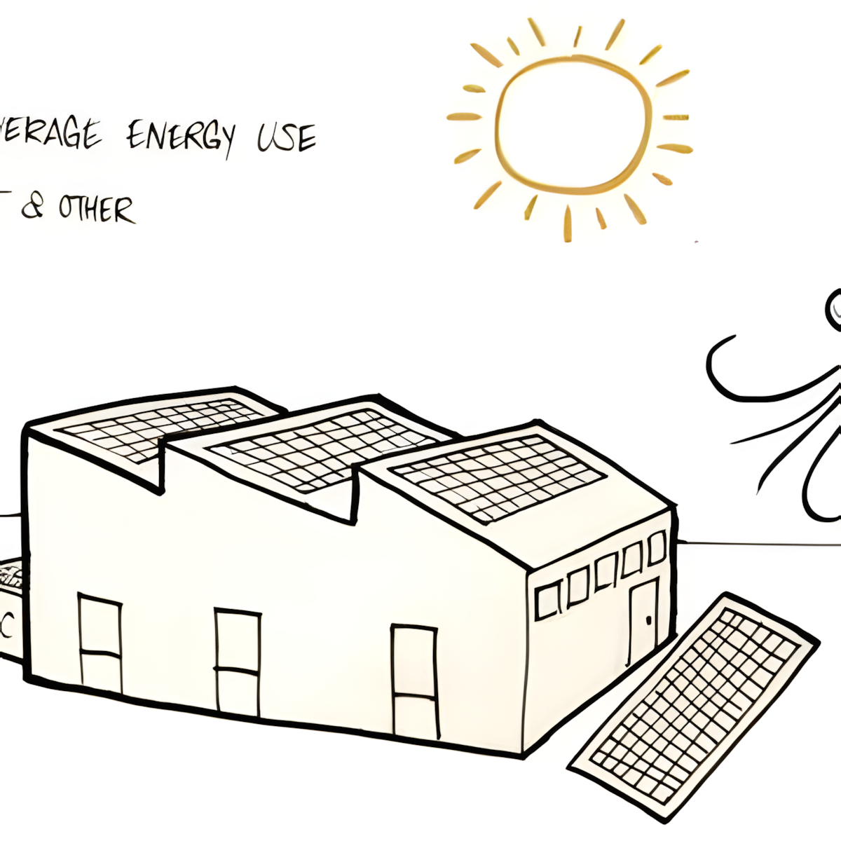
Different programs and schedules cause very different energy use
The program explains how the design will be used by specifying things like activities, occupancy, and schedule of operations. It also includes more detailed requirements such as: room sizes, space needed per person, relationship between spaces, equipment needed, and budget.
All these considerations affect the building’s energy use.
Types of Programs
Some building programs are much more energy-intensive than others, and have different site considerations. For instance, in the US, educational buildings are relatively low energy intensity (averaging 83 kBTU/ft2/yr, 26 kWh/m2/yr) and are dominated by heating loads and lighting loads, while food service buildings are the most energy intensive (averaging 258 kBTU/ft2, 81 kWh/m2/yr) and are dominated by equipment loads.
For a detailed list of different energy intensities for different building programs in the United States, see the US Energy Information of Administration, 2012 Commercial Building Energy Consumption Survey: Energy Usage Summary.

Scheduling
Smart scheduling of building occupancy can reduce the need for active heating and cooling in a building, by avoiding the times of day or year with the harshest climate. For instance, a school in a hot climate can lessen its cooling energy needs by not holding classes during the daytime in the hottest summer months.